We did it!!!! We couldn’t be happier! The primary suite is finished!!!!
We are so happy to have you here for my One Room Challenge Reveal. As a reminder, The One Room Challenge is a biannual forum -Spring and Fall- for participants to have a fun and complete a room transformation over a six week period. Like last year, we were given an additional two weeks (thank goodness!) due to COVID. We participated for the first time as a Featured Designer (we can’t believe it!) to renovate primary suite area: bedroom, bathroom and closet/dressing room.
Interested in checking out previous week’s post?
This post contains affiliate links and sponsored product. It costs you nothing to click on any of these links but I may get a small commission from you using them. Thank you for supporting the brands that support Impeccable Nest.
Befores of the Bedroom
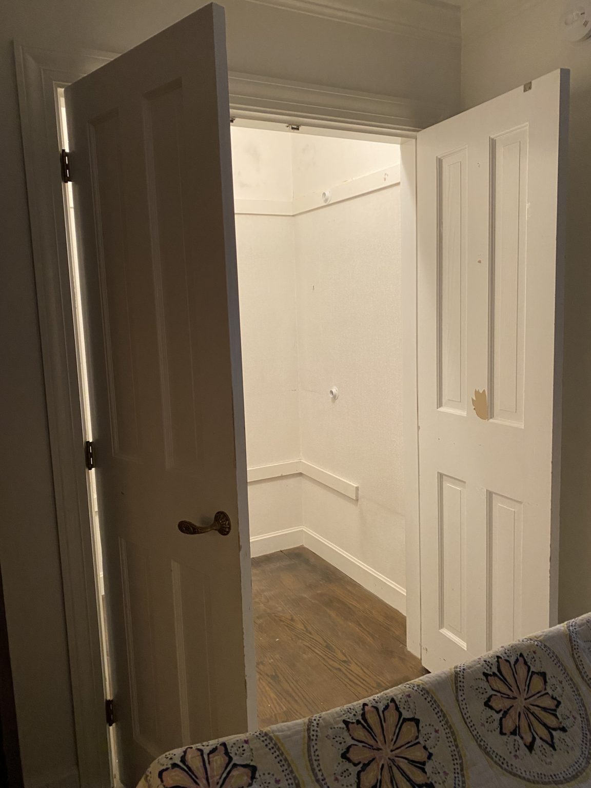
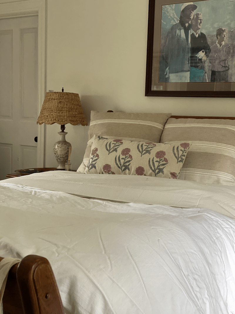
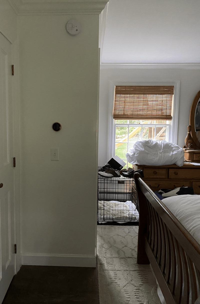
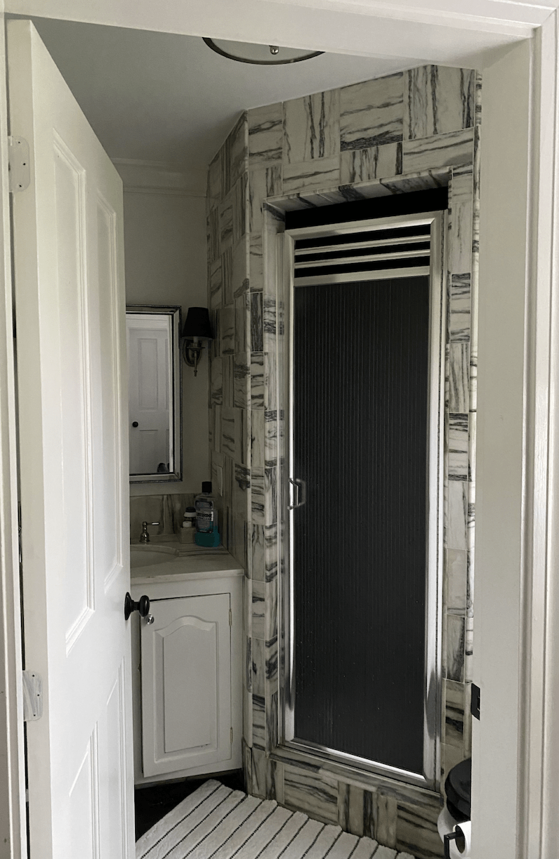
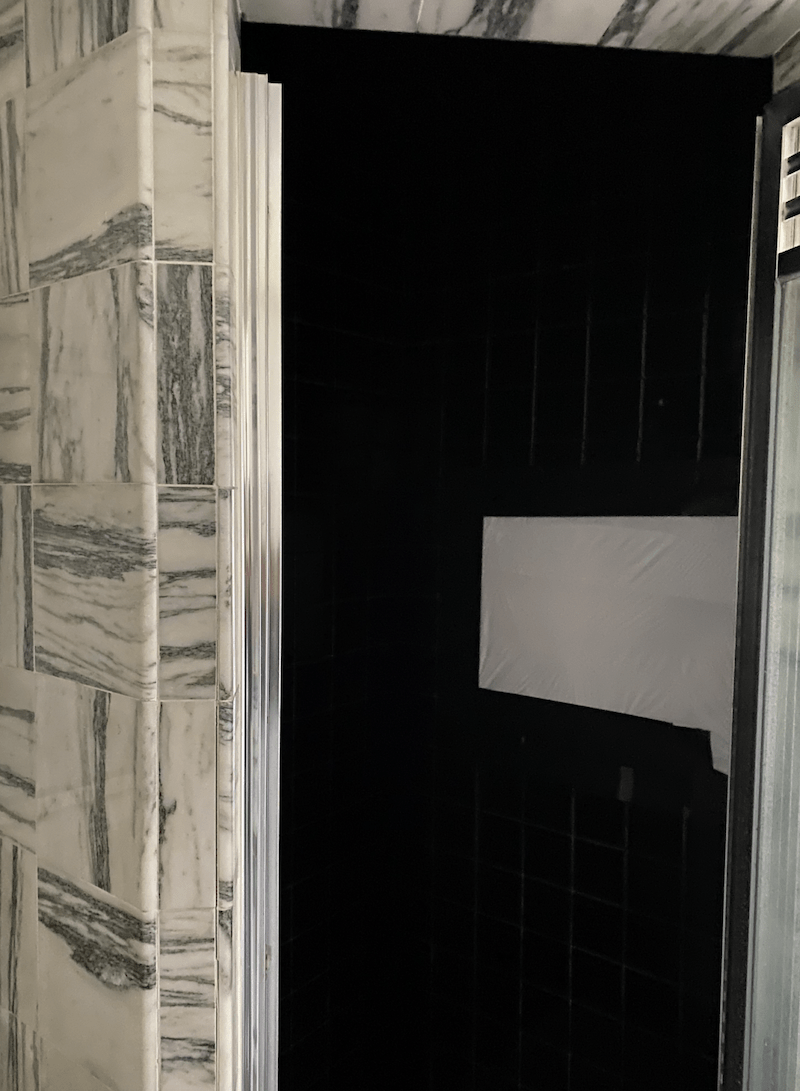
The Process
We seriously had to rethink this bedroom layout. There were far too many issues: namely there were too many closets, unused space and a very tight walk space between the bed and the bathroom.
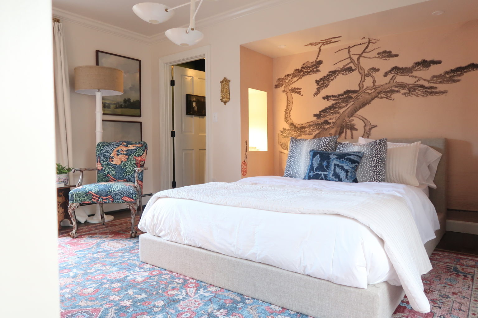
So, we got creative. If you read this post, you would see that we had a few different decisions to make, but ultimately we settled on creating a bed nook, with side niches instead of nightstands. Check out how it all turned out below.
Bedroom Reveal

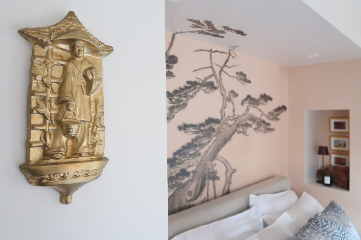
The Walls
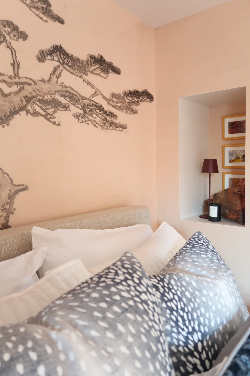
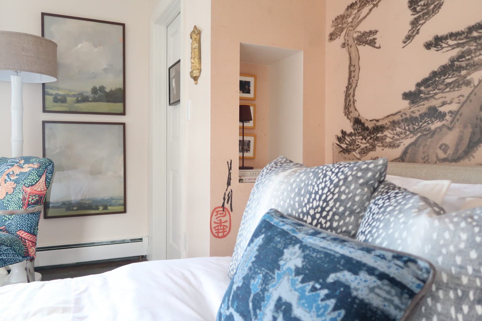
We found this awesome mural from our friends at Milton and King, and knew that it had to take center stage, which it did in the niche. This was the perfect spot to place this great mural. And while it could have been cut off at the top, we decided to cut out the branches and have them continue on the ceiling. This is our favorite way to continue a pattern in an unconventional way.
We complemented the walls with Kelly-Moore Paints Antique Oyster. It’s the perfect creamy white color that helped warm up the room. We took the same color and painted the crown, and ceiling Antique Oyster.
It’s important to consider adding drapery to a space. We also included some great quick ship drapery from Calico in ivory linen. They added much needed texture and warmth to the space. It immediately makes it feel like a luxe boutique hotel suite.
The Bed

We decided to get rid of the previous furniture, it was oversized, and very brown. And brown isn’t a bad thing, but it wasn’t working in the space. Not only were we in need of another bed, we really needed another mattress. After 20 years, it was definitely time for an upgrade.
Before we even started this challenge, we were looking at Saatva mattresses. So, it was serendipitous to find out that they were sponsoring this years One Room Challenge. We jumped at the chance to work with them, and we couldn’t be happier. In fact, the mattress is so comfortable. We chose the Latex Hybrid Mattress, and added the Percale sheet set in white, and percale duvet in ivory. This was a serious upgrade! And so comfortable.
The only thing to make this primary bedroom better, would be the Santorini Bed. It’s in linen, and totally works with the boutique hotel vibe. We did remove the legs in order to see more of the mural, but either way, it looks so good.
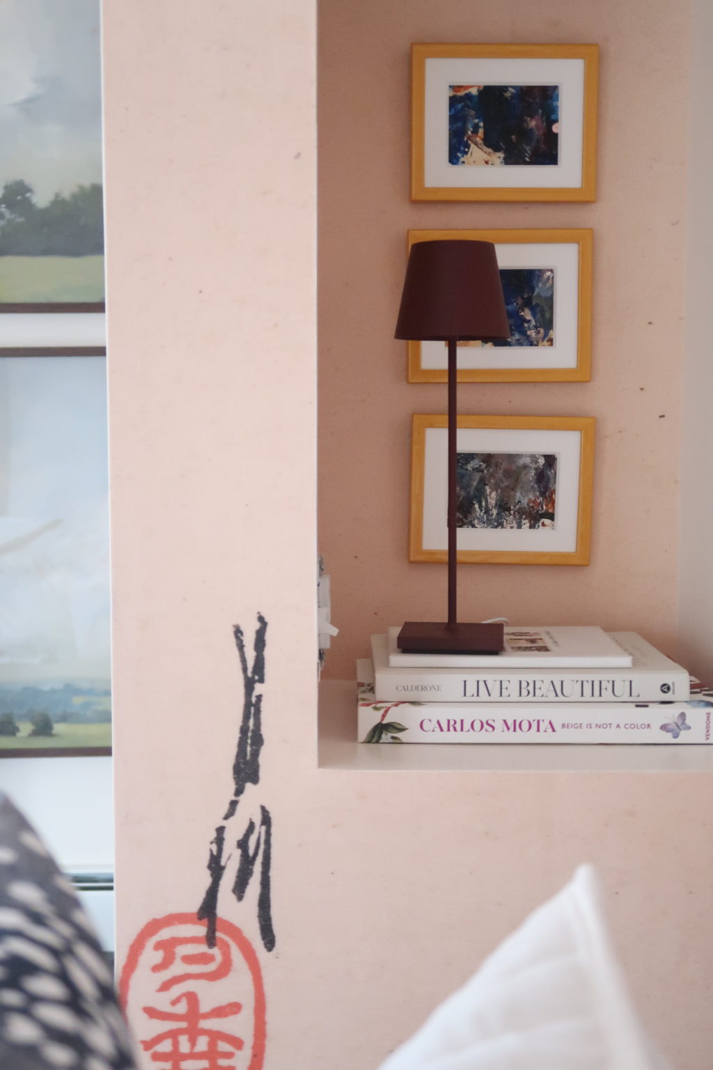
Let’s talk about those niches!
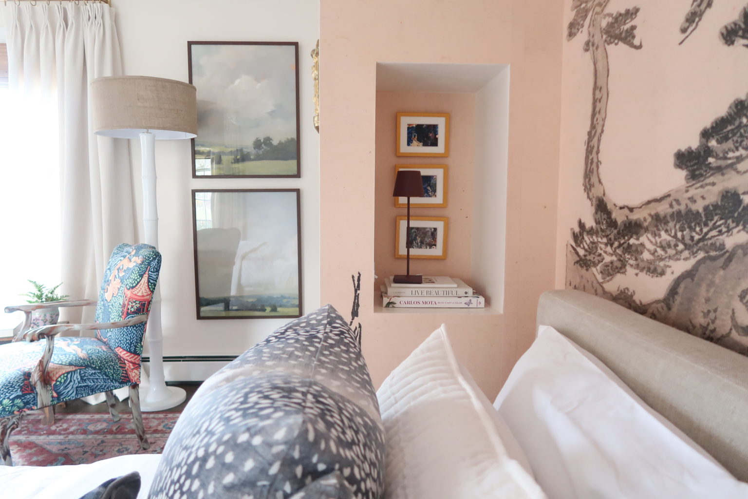
Since we had to recess the bed into a wall, there was little room to add nightstands (well, no room). We made the nook for the bed to fit a king size bed, and while we only have a queen there is still room available. What was the plan? Well, we planned to add niches into our nook.
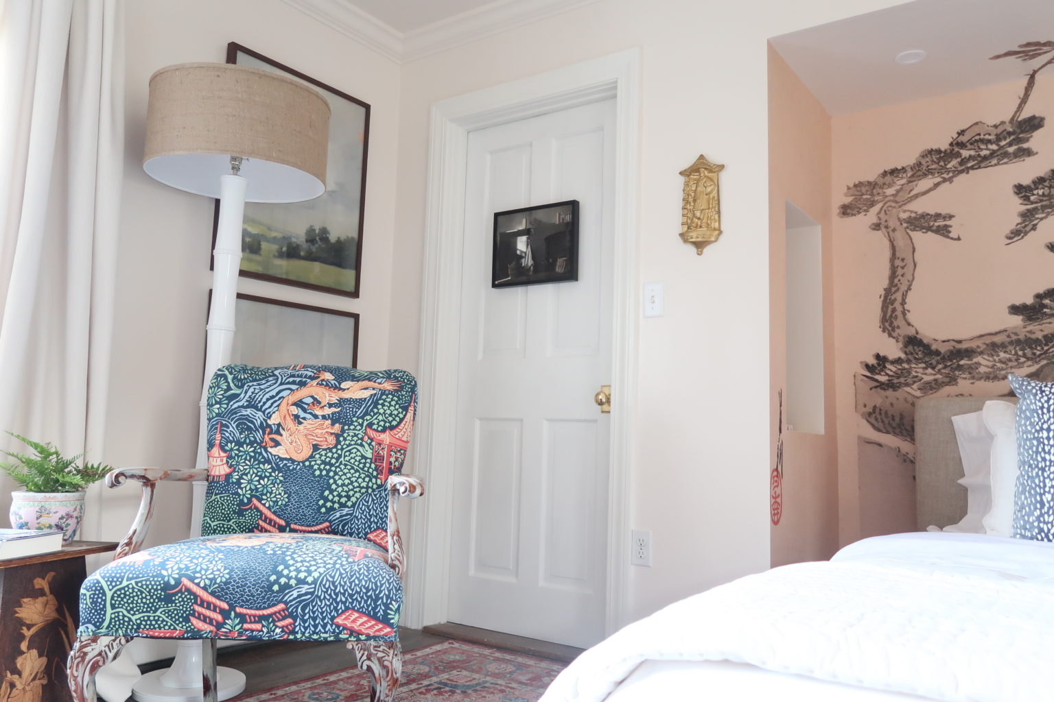
Reading Corner
Of course there was some extra space, so we added a cozy reading corner. It’s a primary bedroom suite, which means a place to relax, and escape. Our friends at Dunes and Duchess created this lovely floor lamp, which only illuminates the beautiful pastoral artwork from Minted.
The Lighting
As if all of this wasn’t enough, we decided to gild the lily and add an extraordinary light fixture from Blueprint Lighting. We went with this…
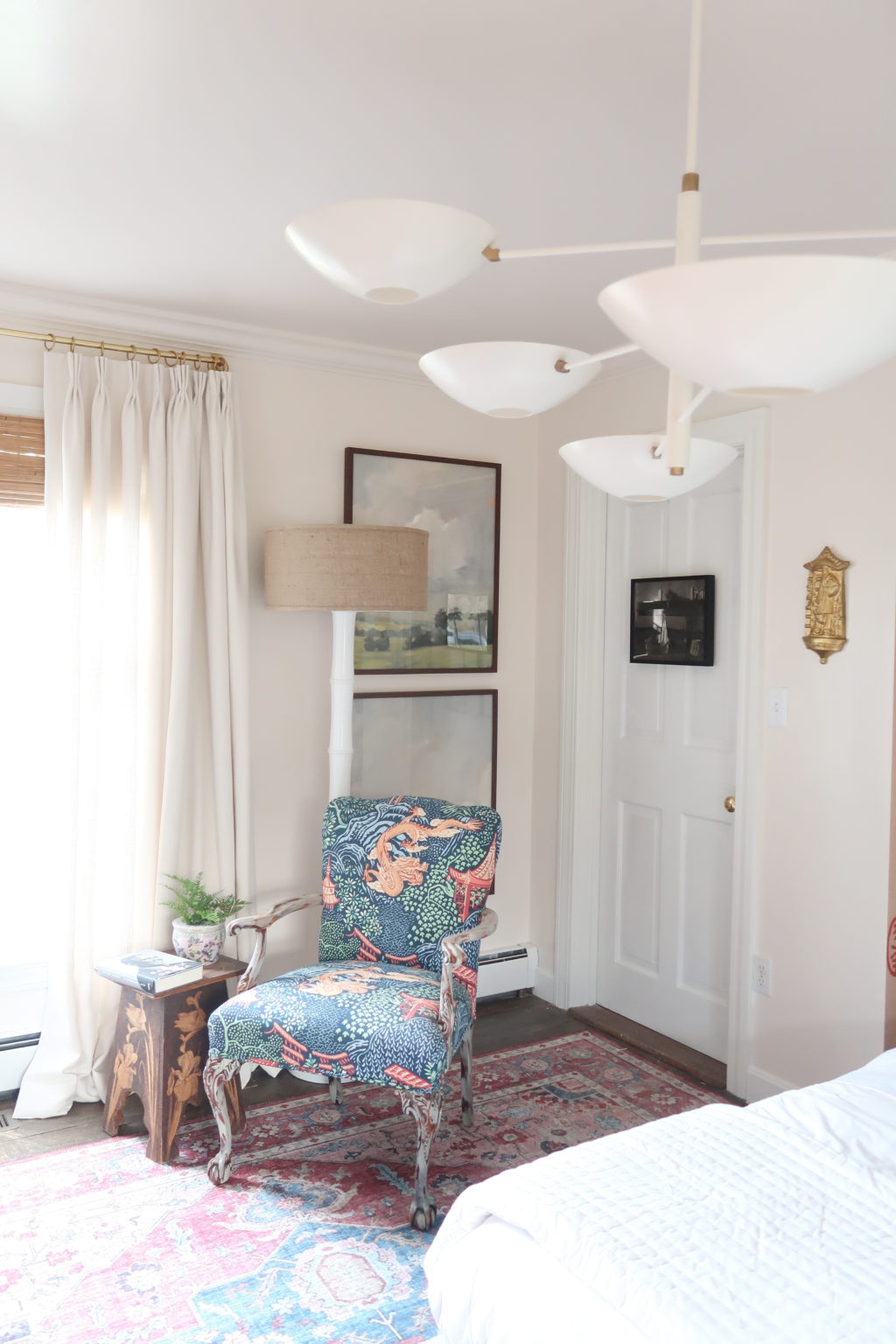
The perfect contrast to the space…the perfect modern addition to the space. Especially when you see it next to the bathroom. We love a lesson in contrasts. It reminds us of an Alexander Calder installation, and it’s made to order. We were so lucky to receive this custom light fixture, if you’re interested check out all of the details here.
The Floors
At first, the plan was to add a checkerboard painted floor, however, they’re a deep colored hardwood floor. They look beautiful in the space, and really look great with our Loloi rug.
At the end of the day, we couldn’t be happier with the push to wrap up and finish this room. We are so grateful for the opportunity given to us from Linda, the creator of the One Room Challenge and the entire Better Homes and Gardens team. Thank you to all the trades and contractors that worked on our space: Andre Oriol of Oriole contracting services (Auburn, NH), Sherman Drywall (NH), Evan Jones Electrical (NH), and LHR plumbing and heating (Bedford, NH).
But most of all…we are pleased with all the pieces that brought our room together. Here’s a list of all our sources:
Bed: Mattress, Santorini Bedframe
Bedding: Cotton Percale Sheets, Duvet
Rug: Loloi Skye Rug
Wallpaper: Japanese Hillside Mural
Drapery: Ivory Linen, Quick Ship
Paint: Antique Oyster, Semi-Gloss
Pendant Lighting: Counterbalance
Artwork: All from minted
Stay tuned…
Next week we will share details over the primary bathroom and closet/dressing room we also tackled. It’s a part 2 of this year’s One Room Challenge.
And if you needed more inspiration, and have been following along, be sure to check out the other featured designers…we are certain you’ll be inspired!

We’re Emma Carole Paradis and Kimberly Carole, the owners and designers of Impeccable Nest, based in Bedford, New Hampshire. A mother-daughter team with a love of design. Originally from Manhattan Beach, California, now based in Bedford, New Hampshire, we bring a Southern California cool and New England tradition to our design. Not only do we work together…we also live together in a multi-generational home…and a home that they are known to design for others.
